Project Details
Web: resilienzzentrum-drk-rems-murr.de
Services: Logo design, brand identity design, social media template design
Web: resilienzzentrum-drk-rems-murr.de
Services: Logo design, brand identity design, social media template design
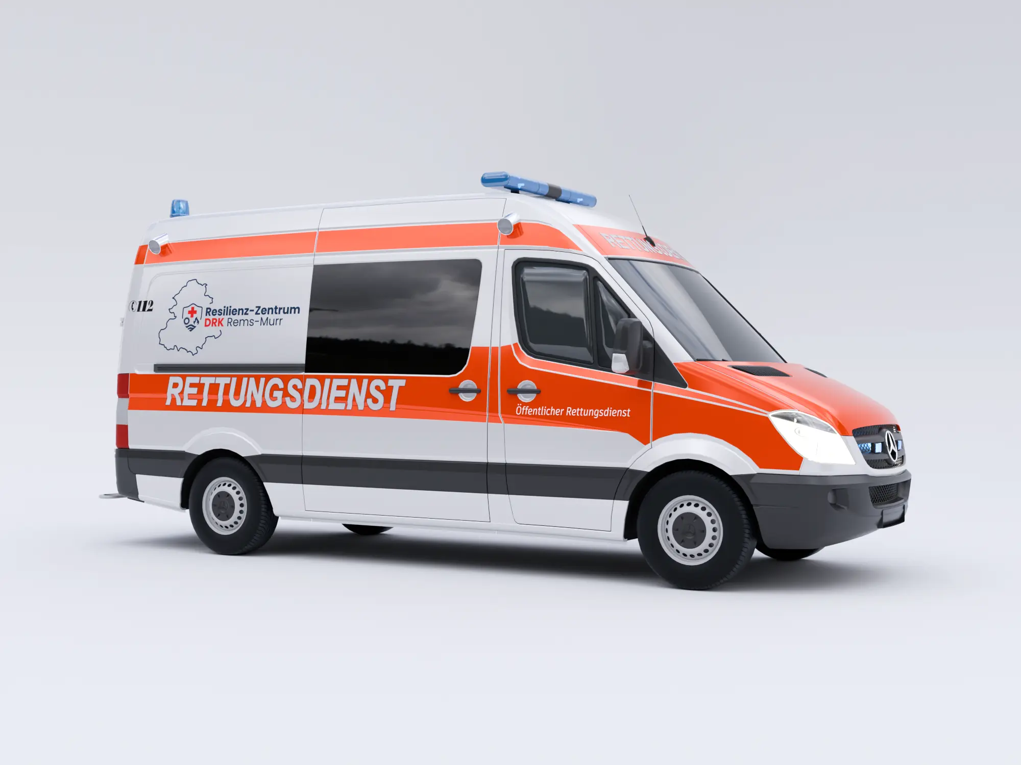
The visual identity project for the German Red Cross Resilience Center in the Rems-Murr region was developed in collaboration with Bebop Media. Our work covered the complete visual system, from the logo and decorative brand graphic to reusable social media templates.
We created a visual identity that brings together the center’s regional character, humanitarian mission and core values of resilience, community and safety.
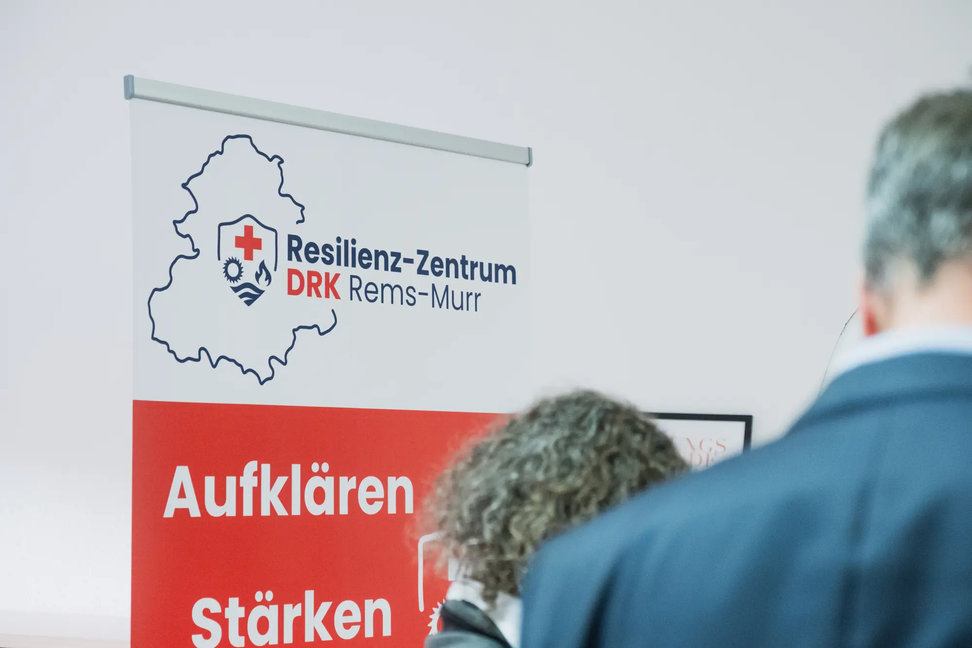
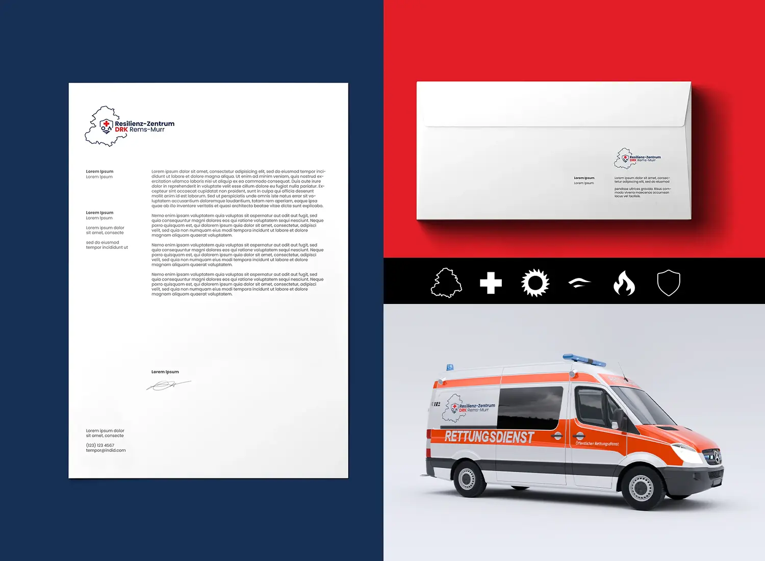
The logo is built from a series of symbols that work together as a recognizable visual system and communicate the purpose of the center.
The outline of the Rems-Murr region reinforces its local and regional focus, while the red cross serves as the internationally recognized symbol of the German Red Cross. The sun represents energy, vitality and proactive preparation for climate-related challenges such as heatwaves. The wave elements reference the Rems and Murr rivers while also communicating adaptability in the face of flooding and environmental change.
The flame represents risks such as fires and power outages, but also inner strength and community resilience, while the shield is a traditional symbol of protection and safety.
Together, these elements reinforce the center’s core mission: protection, education and building community resilience.
A contemporary, highly legible typeface was selected to communicate stability and strength while performing consistently across digital and print applications. The overall identity reflects the center’s role in strengthening communities through education, preparedness and solidarity.
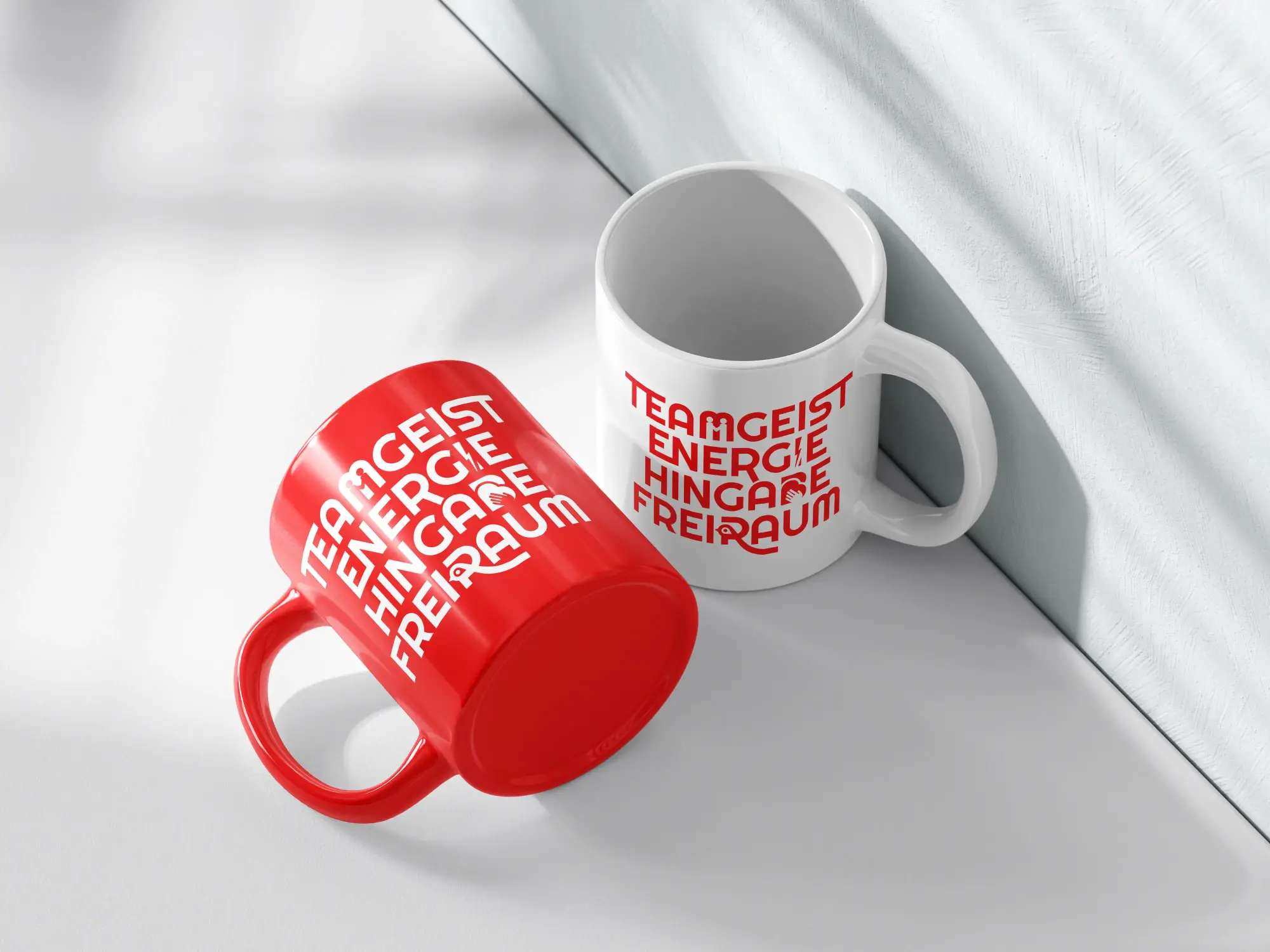
We also developed a decorative typographic graphic that communicates the center’s values of community, energy, commitment and freedom through the individual letterforms.
Each letter incorporates its own symbol and meaning, turning typography into an active visual element of the brand communication.
At the top of the letter “M”, two human figures with raised arms represent teamwork, community and solidarity. The letter “I” is replaced by a lightning bolt, a universal symbol of strength, movement and energy.
Within the letter “B”, a heart and a hand represent care, empathy, support and active engagement. The letter “R” incorporates a stylized bird motif symbolizing freedom, peace and the opportunity for growth and development.
The typography balances strong geometric forms with softer, rounded elements. The result turns text into imagery, with each letter functioning as a communication symbol within a distinctive and recognizable visual system.
We developed a flexible social media template system designed to support the center’s different communication needs.
The templates were created to maintain a consistent online brand identity while providing a clear, professional visual framework that reflects the organization’s values of community, resilience and humanity.
The concept includes a three-slide post format as well as an animated Reel in which the slides transition dynamically between one another.
By extending static content into motion, the system adds greater visual impact and engagement while helping the center maintain a consistent and recognizable presence across social media.